For real estate agent Jarred Hanson, one of the most important design criteria of his new office was the look. “The office is a billboard for my business,” Hanson asserted. Located in a storefront on the historic Main Street of Lake Elsinore, California, the office would be a very visible demonstration of Hanson’s taste and judgment concerning properties. It needed to send the right message. Working with a palette of white, light gray and wood grain, Hanson transformed a small space with simple elements – exposed brick painted white, luxury vinyl plank floors in a bleached-wood pattern and, crowning it, a high-performing decorative ceiling from Ceilume.

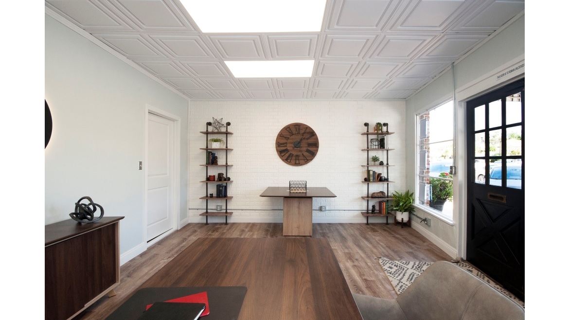
The design conveys a sense of both order and style, with numerous rectangular shapes brought together by the ceiling pattern.
Photo courtesy of Brix Realty via Ceilume
Hanson and his wife both grew up in the small city of Lake Elsinore and returned there after college. As Hanson’s real estate business grew, he wanted to open his own office and decided to do it on Main Street in a brick building that is over 100 years old. The space had most recently been occupied by a print shop and, according to Hanson, “They didn’t take care of it at all. The carpet was worn, the paint was bad, the dropped ceiling had really old ceiling tiles, outdated light fixtures. It looked really dumpy. For my office, specifically because it’s small, I wanted to have as big of an impact as possible on people walking by. I had to make the space a reflection of my business, so I had to have things that made it pop. That’s why we put in the shelving accents, the flooring, the paint…but I couldn’t do all of that and have ugly ceiling tiles.”
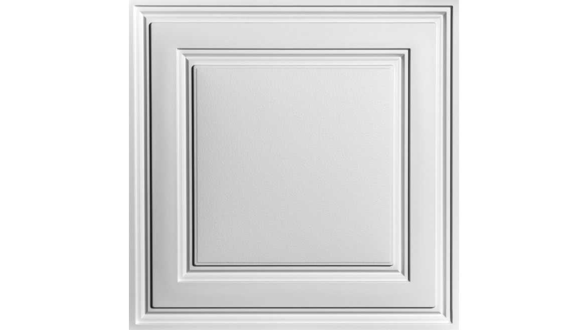
The Hansons did a lot of brainstorming and searched for inspiration on Google, Etsy and Pinterest. They initially considered stamped metal tiles for the ceiling but found them “really, really expensive,” and Jarred realized that a vintage look was not what he wanted. “I wanted it modern and pop-y,” he said. He found just what he was looking for in thermoformed tiles. Ceilume’s Stratford style in white, a clean pattern of concentric squares, complements modern architectural styles well while adding a note of formality.
Installation went easily. The tiles fit the existing 2x2 grid and are considerably lighter in weight than metal or mineral fiber tiles. “It was a breeze,” Hanson recalled. “I did it myself. I went in the evening, and I was done in 30-40 minutes for the whole space. They were that easy. It was like, open ’em up, slide ’em out, slide ’em in, done.”

Ceilume’s Stratford tile is a shallow-relief pattern of concentric squares that complements both traditional and contemporary architectural styles.
Photo courtesy of Ceilume
He also wanted to expose the structural brick on the side walls – tying in with the company brand – but found it was too expensive of a process. Instead, he added white faux brick on one entire wall and a discreet area of faux brick on the opposite wall (covering the place where there had previously been a connecting door to the adjoining storefront). Wood-grain plank flooring complements the dark wood furniture. He kept the wall décor minimal, making a small space seem a little larger. But Hanson feels that the ceiling brought the whole project together.

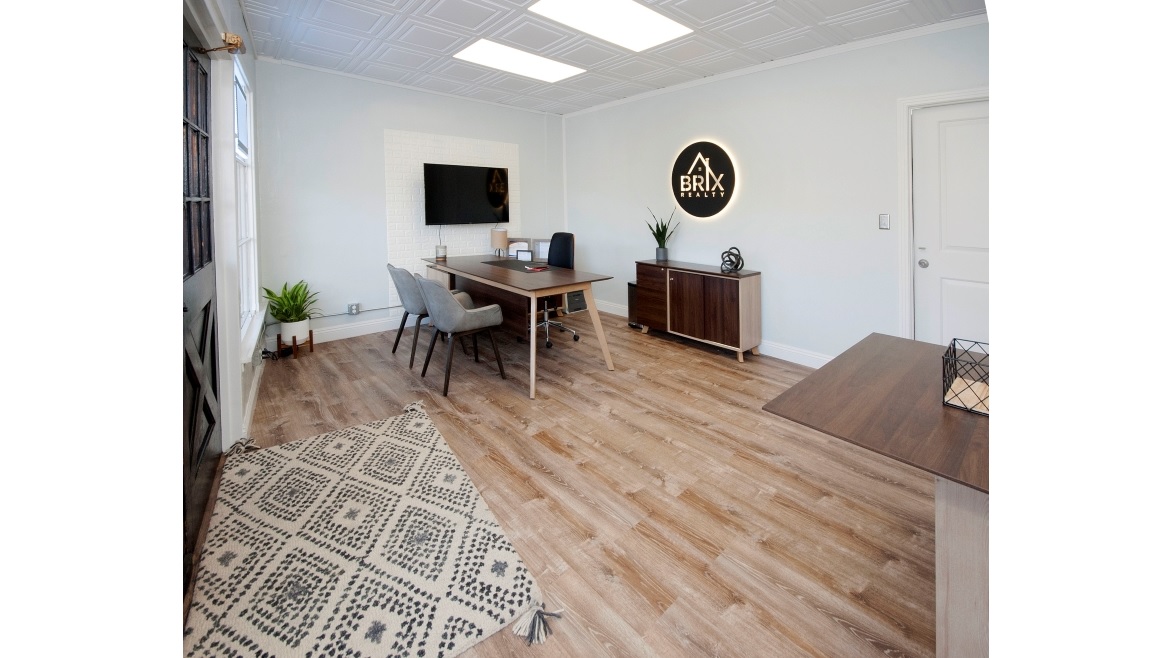
Amidst the many rectangles – the windows, the exposed brick side walls, the furniture and the ceiling pattern – the circular company logo pops impressively.
Photo courtesy of Brix Realty via Ceilume
The overall result, simple and decoratively modest, is extremely effective. The design achieved Hanson’s goals, and the business has been doing well. “I get people saying, ‘Oh my, I love your office. I wish my house looked like that,’” he said. “And that’s the idea because it’s a real estate office. I want people to say, ‘There’s a sense of style. That looks great.’ as they walk by.”


