The city of Rolling Meadows, Ill., recently debuted Fire Stations #15 and #16, located approximately five miles apart. The goal of the much-anticipated project was to optimize services and response times to best serve the community. The Naperville, Ill.-based architecture firm Healy, Bender, Patton & Been won the bid for the contract to design both structures. Founded in 1935, the firm has maintained its original mission statement, “To be a trusted adviser; to bring practical, cost-conscious design to our clients and in doing so, never lose sight of our commitment to client service and bringing the best ideas to the table.” Senior Architect and Project Manager Scott Rihel explains the origins of the dual venture.
“Every fire station design is a response to the owners’ requirements and needs,” he says. “As we develop the design, it evolves based on the configuration of the site, the visibility of the building, the aesthetic of the surrounding neighborhood and a host of other factors.”
Since this was a design-build project, Rihel and his team collaborated with RC Wegman Construction on both sites. As part of its services, Rihel’s team completed a needs assessment to determine the ideal locations as well as structural configurations to allow for optimal deployment times and getting the first responders out of the firehouses as quickly as possible.
“For this project, we worked directly with staff at the fire station to determine specific needs,” Rihel notes. “Both designs included three apparatus bays, a full kitchen, fitness area, bunk room and changing room. In addition, Station #15 plans included a suite of administrative offices.”
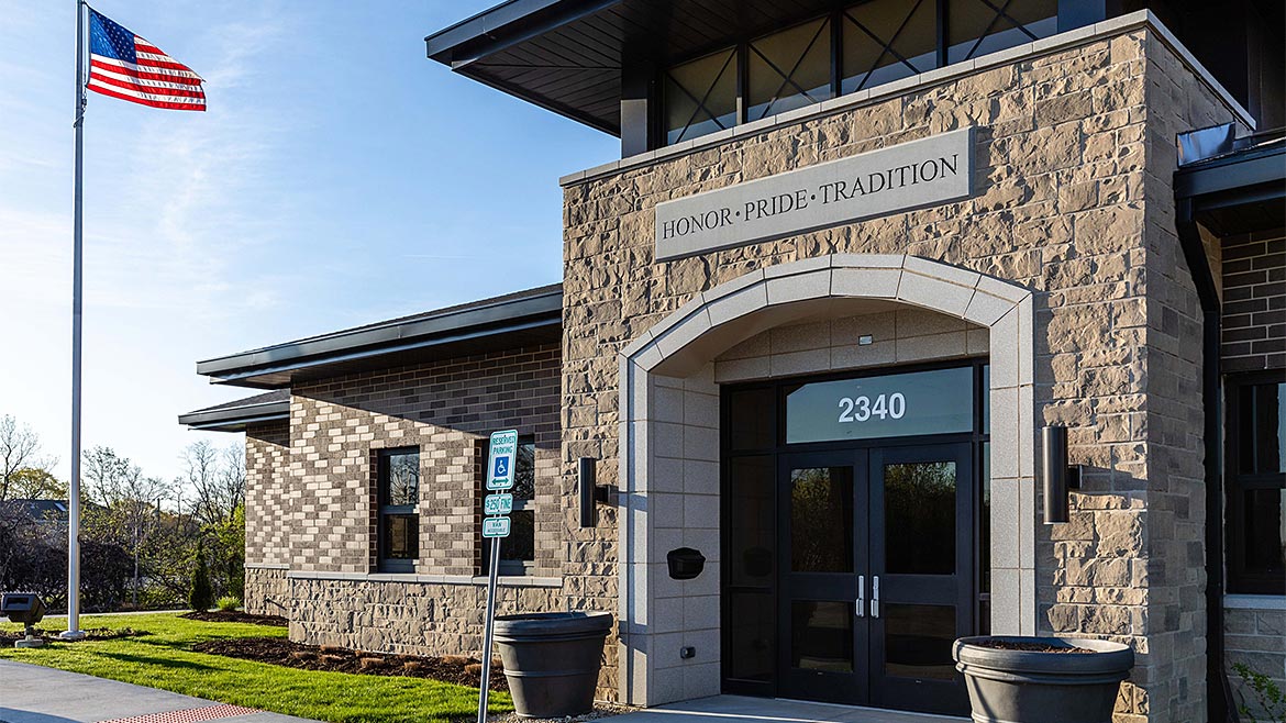
Because of its headquarters designation, Station #15 is designed to stand out, so the front entrance was designed as an iconic element with materials that looked permanent and appropriate for a fire station. Rihel turned to the experts at Northfield/Echelon to explore masonry options for the project.
“We like to keep up with new materials and research and development advancements,” the architect recalls. “We found a national brand of full-depth veneer solutions, as well as thin veneers for the accent details that met our needs perfectly.”
Design Considerations
The veneers were designed to evoke a natural, time-honed look with beautiful, antiqued edges and a textured face. A diverse array of colors and sizes are available to suit any design need. The integrated color allows for a consistent, easy-to-follow, blended pattern.
“We wanted the stone material we utilized to mimic some of the surrounding residential and commercial structures,” Rihel notes. “We were trying to pick up on that local character, so we wanted to complement the neighboring buildings in both color and pattern.”
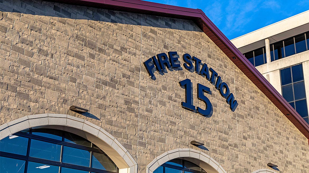
After selecting different veneer colors, Rihel and his team were able to view the materials on-site and determine how well each complemented the neighboring structures. After an in-depth selection process, they chose a gray shade to complete the dominant ashlar pattern used for both stations and a graphite color for the complementing trim.
“It really fits in with the character of the city,” Rihel adds. “There are several monuments throughout the city, and the stone veneer materials complement that look.”
Rob Solfisburg, project manager for Joe’s Masonry, oversaw the installation of the veneer products on the Fire Station #16 site. He had a similar reaction to the aesthetic appeal of the two shades.
“It’s a beautiful building,” Solfisburg says. “The architectural design afforded us an opportunity to use masonry in its finest form. This building will have a long lifespan. It gives strength to the municipality it represents.”
Many Options for Use
The versatility of stone veneers allowed for a great deal of design flexibility. The hand-cut stone gave Rihel the option to use a combination of load-bearing and non-load-bearing materials.
“We used the full-thickness stone from ground up—25 to 30 feet high,” Rihel explains. “Where it wasn’t bearing on the ground, we used a thin non-load-bearing material that hung off the side.”
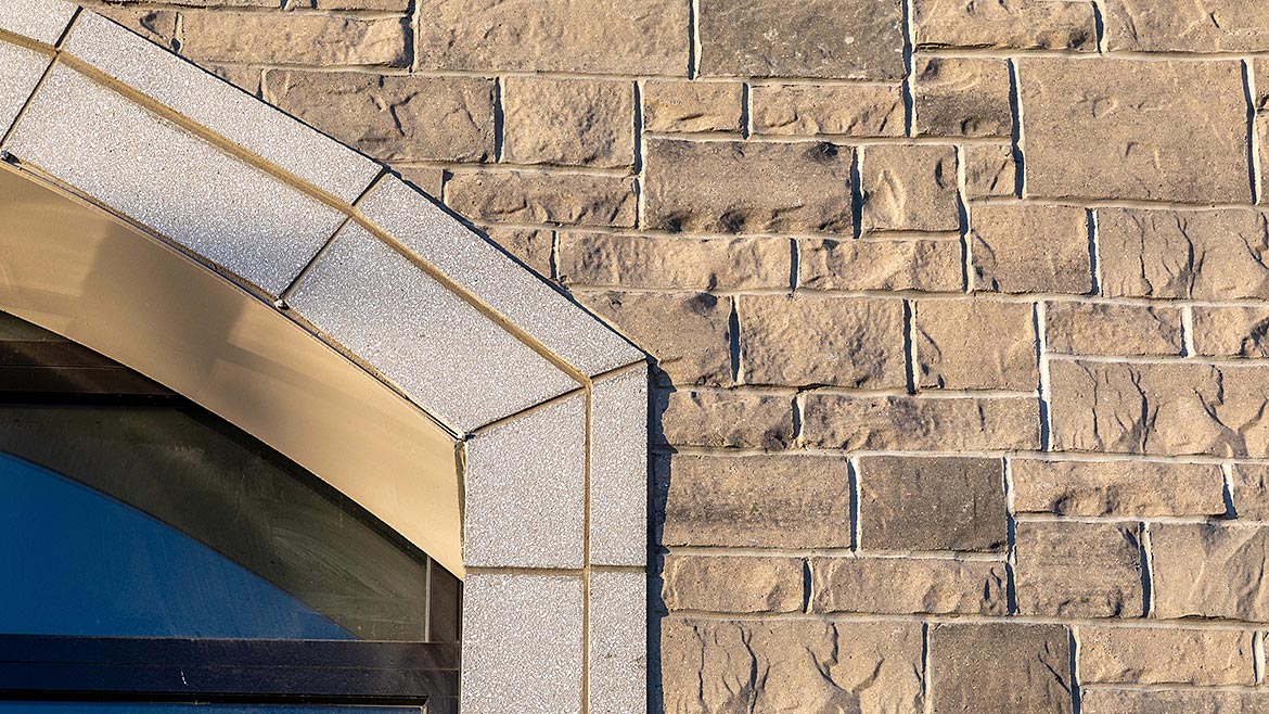
Although most of the stone veneer on this project was full depth, full-bed stone was pre-cut at the plant to an adhered veneer, which allowed for a wall-to-wall seamless transition where needed.
Cal Riegle, estimator and project manager with Midwest Masonry, contracted for the Station #15 job. He comments that using stone veneer allowed the company to tie everything together; it was easy to install alongside the other masonry units that Midwest Masonry used. “The design and skilled construction resulted in a remarkable, finished building,” he says.
Concrete masonry was also used for the windowsills, tower sills and trim around doors, and to create the apparatus bay borders for both fire stations as well as the entrance doors.
“The arched openings provided a bold, striking focal point of the building,” Solfisburg notes.
The high-density architectural stone cladding achieves the look of natural stone by incorporating all-natural aggregates and recycled content, delivering the prestigious appearance that has remained a desired look for centuries. It is known for its durability, design flexibility, ease of installation and beautiful limestone appearance, all of which allow for an elegant and enduring look.
Since the new fire stations were completed, the community response has been enthusiastic. “The feedback has been overwhelmingly positive—the city loves it and the firemen love it,” Rihel says.
The fine craftsmanship of both fire stations reflects the firefighters’ creed commemorated on an engraved plaque located directly above the front entrance archway of Station #15: Honor*Pride*Tradition.




Report Abusive Comment